style | sound #1 - a simple matter of conviction
I write. You read. That's it.
In a prior newsletter I laid out the natural connections between sight and sound.
In summary: for most of our existence music could only be heard and seen — not simply heard. It is a relatively recent phenomenon to be able to disconnect song from artist, or at least performer. And now current culture has found itself gravitating back toward the visual and sonic pairing — whether that’s through the popularity of music videos or another means.
Now it’s time to dive headfirst — arms outstretched, legs arrow-straight — into one of my favorite, strange obsessions: analyzing and celebrating the style of 20th century record covers.
This is style | sound.
It seems inane and it truly is. And yet I cannot help myself from engaging in it. Discovering an exquisite album cover is a delight, a bit of a dopamine kick in a potentially otherwise dull day.
And the design art of an album cover is actually quite important — like the wrapping on a gift, only more so. You have to convey so much, sell so much, on 12.375 square inches. You need to convince someone to buy your record as well as transmit the tone, vibe, and, yes, style of your sound. That’s a lot of work, a lot of expectation, for something a hair’s breadth over a foot in length and width.
Before we start though, I’ll lay out some boundaries for an appropriate style | sound, sketch out the sandbox so to speak.
One of my so-called “rules” for style | sound is that the album cover must feature human beings. It simply cannot fall into the category of ‘having style’ if there are no people being stylish on it. Another “rule” is that the cover — and recordings contained within — must have originated some time in the 20th century. This is a less hard and fast rule than the first. Call me old fashioned, I just simply lean toward the 20th century’s musical offerings, which is not as oddball as it is often made out to be — as this excellent article by Ted Gioia in The Atlantic points out.
Now, what makes style in this context? What will qualify a cover for style | sound?

I wrote that style is the how, the way — it’s approach, process, method. Not point of origin nor point of landing. However, in this case, style | sound will have a fairly loose conception of the style component. Basically, you know it when you see it, to paraphrase Supreme Court Justice Potter Stewart’s 1964 ruling on obscenity.
We’re talking about covers with spark, pizzazz, zhuzh. More importantly, we’re talking about covers that spark, that pizzazz, that zhuzh. This is as much, if not entirely, about our response to the cover as it is about the cover itself. Style is about the way it makes us feel, the way it makes us sing and sizzle. This is why the most stylish people are often perceived to be the most comfortable in their skin and in their dress. While we’re not designing the record cover — “dressing” it so to speak — we ought to be responding to it emotionally as well as intellectually.
Keep this last word in mind too: zhuzh. Oxford Dictionary describes it as “to make something more stylish, lively, or attractive” as a verb or “an act, addition, or quality that makes something more stylish, lively, or attractive” as a noun. Zhuzh is essentially ineffable — a quantity or quality of unknown origins and parameters. A perfect term for an utterly ineffable exercise.
Now, shall we style | sound?
contradiction in style
It is fitting to begin with jazz as the first entry because it is arguably the most stylish genre of music there is. Certainly it engages the finery — the pomp and ceremony — of classical music without any of classical music’s stuffiness and pretentiousness — think tuxedoed musicians, solemn expressions, bows and bowties.
Jazz is contradiction: hard and soft, fast and slow, wild and domestic. It is music for hot nights and rainy days. Nothing else has that moody versatility, that tonal range. In jazz’s tempo changes, its melodic curlicues, you find an answer for every question. In its contradictions style abounds and thrives.
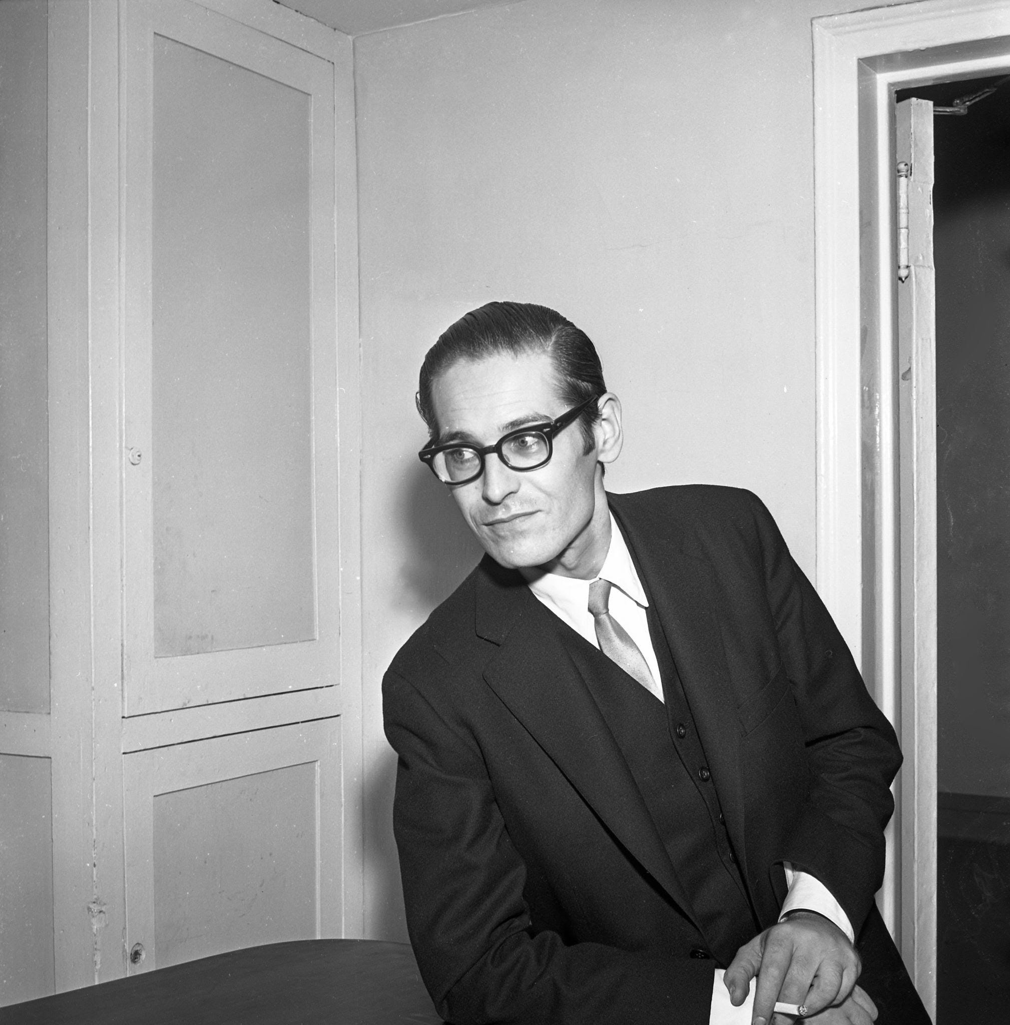
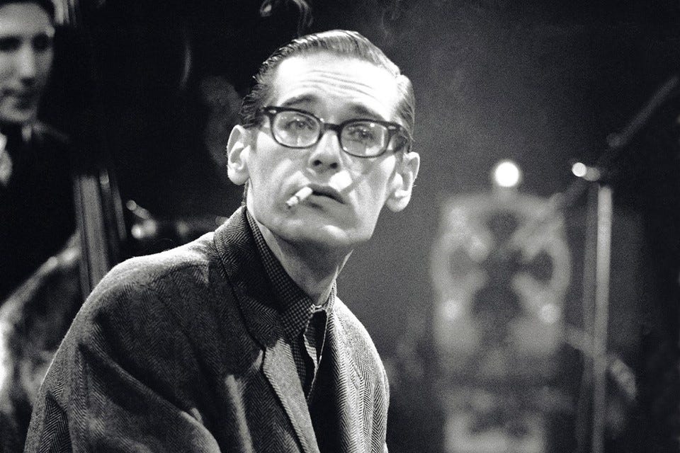
And it is fitting to begin with Bill Evans. With his slicked back hair (earlier in his career at least), sharp suits, rectangular glasses, and high cheekbones, Evans is postcard style. Frankly, I’m surprised I don’t see more photos of him gracing mood boards — not that I’m looking at many of those. He is prototypical of a look that almost never goes out of style: slim, debonair, angular, white.
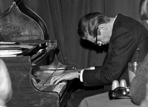
Passion and style often coincide and in Evans’ case they certainly do. His penchant for prostrating himself at the piano gives the impression of a man at prayer, genuflecting before the deities of chord and melody. His hunched presence is a physical, forceful display of passion and one that is bound to his image and legacy as an artist.
An example can be found in the above video, in a rendition of “My Foolish Heart.”
a simple matter of conviction

1967’s A Simple Matter of Conviction is not a particularly well-known Evans’ record — at least so far as I’m aware. It’s not one I often hear people talk about, though it features a song I have come to adore: “Orbit (Unless It’s You)”.
The track list is as follows:
“A Simple Matter of Conviction” (Evans)
“Stella by Starlight” (Washington, Young)
“Orbit (Unless It’s You)” (Evans)
“Laura” (Mercer, Raksin)
“My Melancholy Baby” (Burnett, Norton, Watson)
“I’m Getting Sentimental Over You” (Bassman, Washington)
“Star Eyes” (de Paul, Raye)
“Only Child” (Evans)
“These Things Called Changes” (Evans)
As I was checking the album’s credits, I noticed the photo was taken by Chuck Stewart. Some quick googling revealed that Stewart was one of the US’s most renowned photographers of jazz luminaries like Louis Armstrong and John Coltrane. According to wikipedia, his photos have graced more than 2,000 record covers. I have no doubt we’ll run across more of his work in other style | sound posts.
The album cover photo features the record’s performers — Evans, Shelly Manne, Eddie Gomez — each in a different pose. Evans stands hip cocked, arm tucked by his waist. Manne sits comfortably, one leg crossed over another — fitting given the fact that as drummer he’d be perched behind the kit. Gomez leans behind Manne with his palms on the couch.
First and foremost what catches your eye is the room they occupy: wood-paneled, knightly sigil or crest on the wall, fireplace pokers to the left. It’s a stereotypically imposing, masculine space. The entire photo is saturated in varying earth tones that are, again, mostly associated with masculinity: olive, khaki, chocolate brown, fatigue, charcoal gray.
Next, notice both Manne and Gomez staged in profile, slightly in shadow, and beneath Evans. Only Evans stands at full posture, body oriented toward the camera — though his face too is in profile. Manne and Gomez look toward Evans — he is the star, this is his show. That Evans looks at them is a signal that he understands what they bring to the record too.
All are dressed semi-formally, none wearing ties. The choice of turtleneck sweaters gives an overall impression more of cocktail attire than of heading to the office, but in a sense these men are very much dressed for work. Their office is our club and lounge. Their day job is our night life.
Throughout his early career the pristine suit and thin tie — so 1960s — are inseparable from the image I have in my mind of Evans. But as the decade wore on, Evans shed his tie and adopted a less formal wardrobe, coinciding with the overall relaxation of dress that occurred at the time. Beyond Evans, this trend is visible in many of the era’s cultural figures.
Take the Beatles at the start of their fame, in the early 60s: clean cut, slim suits, bowl cut hair. What people forget is the fact that this was its own kind of revolution — dressing that way, especially in posh England, was quite cutting edge. Now picture the Beatles at the end of the 60s: hair to their shoulders, beards, beads. Psychedelia left its mark. Only Paul McCartney maintained a semblance of so-called respectability in his appearance.
In our cover photo, Evans dons an olive sport coat or blazer, khaki slacks, brown sweater, cream or beige shirt, and light brown — almost beige — shoes, likely suede derbies.
Within the hierarchy of classic menswear, earth tones (khaki, brown, olive, etc.) are less formal than dark grays and navy blues. The reasons are multiple, but the simplest explanation is that earth shades offer both too little and too much visual contrast.
What makes a suit formal is its lack of contrast, the continuity of fabric, color, and cut in a line up a person’s body. The appearance of a clashing shirt at the neck and the hints of color from a tie add distinction, but don’t take away from the seamlessness. Now, ironically what makes navy and gray the classic blazer and slacks combo is its greater visual discrepancy — the clash actually adds smartness. Earth tones like brown and green offset one another but not nearly enough to appear so refined. This is why you should never wear non-matched navy pants with a navy sport jacket. The simultaneous clash and lack of clash disrupts the eye, making you look slovenly rather than striking.
The texture of Evans’ clothing as well adds to its informality. It’s hard to tell from the photo but his sweater seems to have a sheen to it. It might be velour, it might be velvet. Either way, it’s plush. We love plush. Plush is opulent, plush is swishy, plush is swank. But plush is not smart. Nor is it sharp.
The splashes of green and brown and combination of textures that Evans wears make him appear at one with his environment. The room becomes an extension of Evans himself, even though the room is marked by its formality and he by his informality.